LILT Design System: Building a Foundation for Scale
Role
Principal Designer
Responsibilities
- Guild Leadership & Facilitation
- Design System Architecture
- Cross-functional Collaboration
- Accessibility & Quality Assurance
Collaborated with
TL;DR
LILT's rapid growth had created a fragmented UI with 5 different form styles and inconsistent patterns across teams. I led a cross-functional guild to build a comprehensive design system that lowered the amount of UI bugs, improved development speed, and established a shared design language that enhanced team collaboration and user satisfaction.
Challenge & Solution
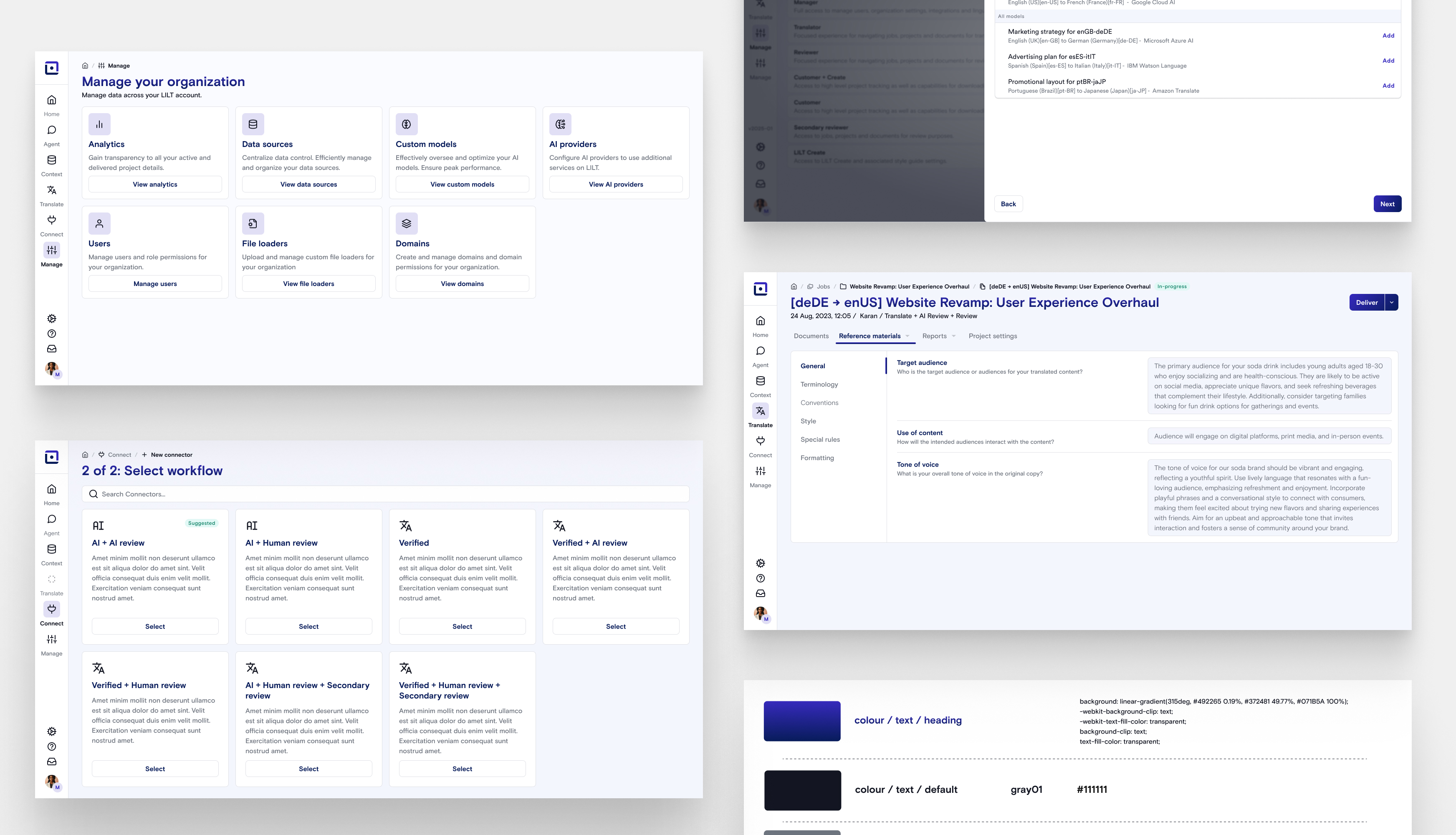
Rapid growth created fragmented UI with three competing implementation approaches—hand-rolled CSS, restyled Material UI, and custom implementations. Problem: Teams rebuilding components, slow velocity, eroded trust.
Strategy: Build coalition, not just components. Led cross-functional Design System Guild to create shared ownership and sustainable adoption.
- Impact: Significant reduction in UI bugs, faster development cycles, improved user satisfaction
- Approach: Comprehensive audit → guild formation → Atomic Design architecture → adoption strategy
- Key insight: Top-down mandates fail—lasting change requires buy-in and shared ownership
Process & Key Milestones
Guild Formation & Governance
Initiated and grew a self-sustaining cross-departmental design culture using a guild model. Recruited cross-functional team passionate about quality and facilitated bi-weekly meetings with lightweight process for component requests and prioritization. Design system evolved from an individual project to organization-wide capability with distributed ownership. Guild members became internal design system ambassadors, reducing my direct involvement while accelerating adoption.
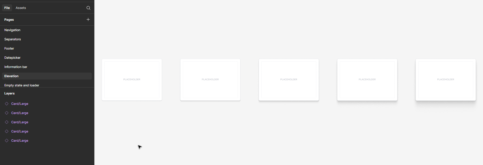
Interface Inventory
Cataloged every UI element, documenting three competing approaches. Visual evidence generated executive support and cross-team buy-in.
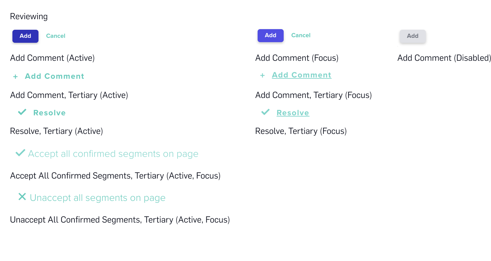
Example from interface inventory showing the variety of button styling approaches and inconsistent state management across the platform
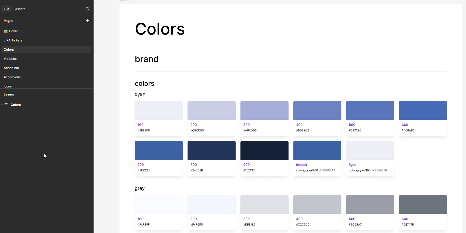
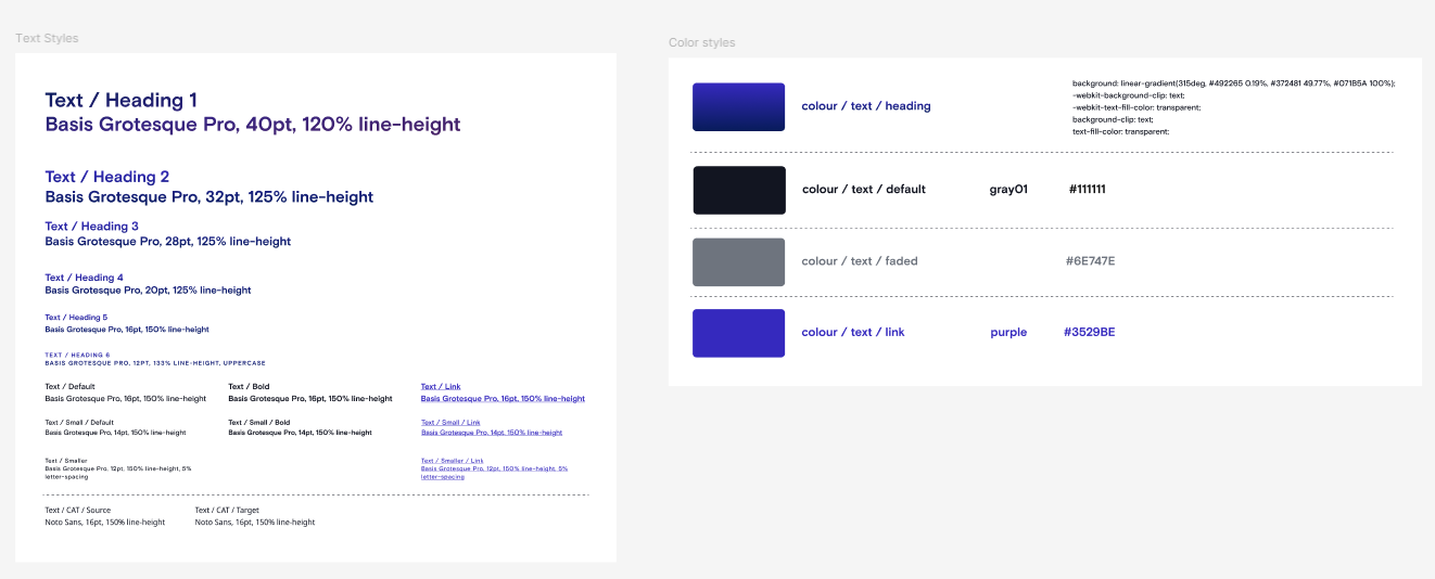
Atomic Design Architecture
Built foundation with design tokens, then atoms, molecules, and organisms. Created common language for designers and engineers.
Implementation & Adoption
Storybook component library, documentation site, monthly office hours. Built-in accessibility with WCAG compliance.
Results: Velocity, Consistency, and Trust
- Drastic reduction in inconsistency & bugs: UI inconsistencies reported by QA dropped significantly within six months
- Accelerated development velocity: Engineers could build new features much faster using the component library
- Improved user satisfaction: Customer feedback praised the improved "polish" and "ease of use"
- Enhanced team efficiency: Onboarding time for new front-end engineers was cut in half
- Cultural transformation: Design System Guild became permanent cross-functional team
Key Learnings as a Principal Designer
Lead with influence, not authority
A successful system is adopted voluntarily. Building a guild created advocates in every team.
Data and evidence are your best tools
The interface inventory made the problem undeniable and built a compelling case for investment.
Start small, think big
We started with tokens and a button. Delivering small, high-quality wins built momentum for the larger effort.
Documentation is a feature
If a component isn't documented, it doesn't exist. Investing in clear, accessible documentation was non-negotiable for adoption.
Process matters as much as pixels
This project was less about pixels and more about people, process, and persuasion.
Most important insight: Sustainable design systems require shared ownership across disciplines—not just beautiful components.